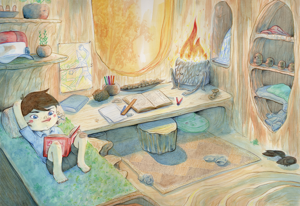
I thought I’d break down the process that I went through to make the illustration from my previous post.
I have been a big fan of James Gurneys blog, Gurney Journey for a long time. It’s relaxed, creative, super positive and full of amazing advice for visual artists of all types. When I read it, I feel I’m getting the art school education I missed out on when I actually went to art school.
James Gurney created (among other things) the hugely popular illustrated book series Dinotopia
University was fantastic for me, but for an artist with my interests, the visual components were severely lacking. We had very theory heavy classes which were more concerned with concepts than aesthetics. This left me pretty much on my own to work a lot of the technique side of things out.
Anyway, James Gurney offers many step by step insights in to his image making process. A wonderful example is this post here although he touches on these ideas in many of his other posts. His style is very naturalistic and based on super accurate observation of light, colour and how they combine to create form. I am pretty loosey goosey with these ideas. I tend to be more concerned with line creating flat shapes and colouring intuitively.
I thought for this illustration, I’d challenge myself to go through the same (well, at least similar) steps that James goes through when making an image.
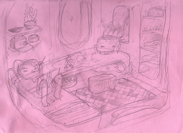
The first step was to do sketches, to develop the idea as much as I could without any external assistance. I wound up with these.
I wanted to do an interior shot of the tree house, one of the characters bedrooms with him reclining and reading. I had a pretty clear vision of the emotions I wanted to convey, of comfort and warmth and relaxation. I remember sitting in bed, reading, exploring new worlds through pages and illustrations.
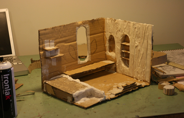
From these illustrations, I then developed a cardboard and clay model of the bedroom. This took a few hours and a little bit of trial and error as I’d never done one before. The materials made it easy to create soft organic shapes, and any imperfections in the molding were welcome as they provided some nice error in design.
After I was happy with the model, I spray painted the whole thing white. James Gurney does this in a number of examples so that observation of shadows and light become obvious. When there is tonal variation in the model itself, it makes it harder to pin point the relative tonal values.
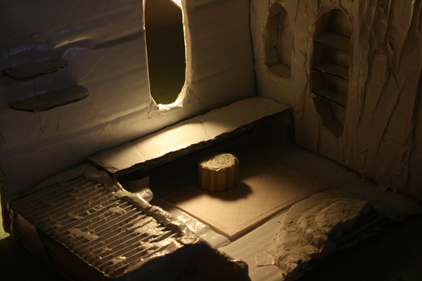
I then played around with lighting the model. I knew I wanted to light it through the window, but this took a while to get right. I knew I was going to have a second light source coming from within the room, but I didn’t really have a way to get that one to work out.
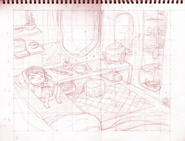
After photographing the work, I did a detailed drawing from it, with the character and props in place. Once finished, I drew a grid over the work so that I could then expand it on to another sheet of paper.
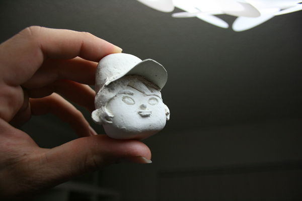
Then I redrew the grid and the work very lightly on to a large piece of thick watercolour paper. I then worked in to it, with the model at hand for reference and the lit photographs beside me. I also had a small model that I’d made of the characters head. Although he is very cartoony, it helps greatly with maintaining the shape of him.
After I was happy with the colour I had laid down, I then worked back in to the piece with coloured pencils to define shapes and give surfaces texture. Then it was done. Unfortunately I don’t have any step by step images of the actual painting/drawing process. I might scan my next illustration step by step so you can see how I work on the page itself.
The model making and photographing was done over a day. This was because of various drying times involved. The actual labour time was much less. The illustration took one full day of work.
Overall the process was fantastically fulfilling and I learnt a lot through it. There are many lighting elements that I would never have anticipated if it had been illustrated straight from my mind. Environmental and character models are something that I plan on investing a lot more time on in the future. I am not so much interested in achieving a level of naturalism that James Gurney does, but it all helps to create a sense of “reality” for the viewer. That they can place themselves in the world that little bit more. Which I guess is the aim of all picture makers.

